Differentiating Between Website and App Issues
Updated on 13. November 2025 by Jan Bunk

Most likely you're here because you or your users found an issue in your app. Sorry about that! Let's see how we can get it fixed as soon as possible.
First, we need to figure out whether the issue is actually a problem with the app, or a problem with the website. Why? Because that will tell us where the issue needs to be fixed. We (webtoapp.design) can only fix it if it's an issue with the app. If it's an issue with your website, you can fix the issue on your website and then the issue will be gone from the app too.
Testing Methods
Browser on Device (Best Method)
Is the issue occurring in the app on your own device? Then you can use this method, which is the most reliable. Open the default browser app on your device (Google Chrome on Android and Safari on Apple devices) and open your website. Now check if you can get the issue to appear like it did in the app.
If the issue appears, it's a problem with your website. Once you've fixed it there, the app should work correctly too. If the issue doesn't appear on the website, please contact us and include step-by-step instructions on how to trigger the issue in the app.
Browser Window
Use the browser on your computer (Google Chrome if the issue was occurring on Android and Safari if it occurred on iOS devices) and put it in window mode. Now resize it to a size similar to that of the device the issue occurred on. So for similar behaviour to a smartphone, you want to make the window slim and tall, while a tablet would be wide and short.
Now, like in the first method, open your website and check if you can get the issue to appear.
If the issue appears, it's a problem with your website. Once you've fixed it there, the app should work correctly too. If the issue doesn't appear on the website, please contact us and include step-by-step instructions on how to trigger the issue in the app.
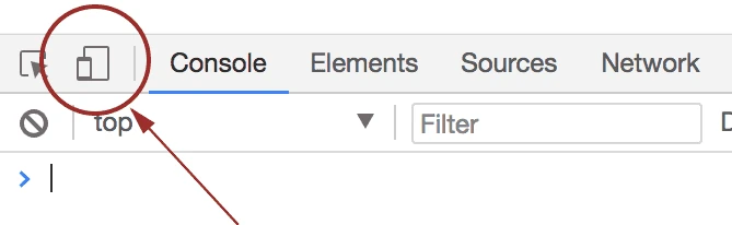
Browser Screen Size Test Mode
This is a more precise version of the browser window method. Again open the browser on your computer. Then open the developer menu by pressing one of the following key combinations:
Ctrl + Shift + I
⌘ + ⌥ + I (on MacOS)
F12
Now click the device icon in the menu that just opened.
Either select the device model the issue occurs on at the top of the screen or look up the devices dimensions on the internet and enter them yourself.
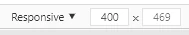
After that you can view what your website looks like on that specific screen size. So, like in the previous methods, check if the issue occurs like that.
If the issue appears, it's a problem with your website. Once you've fixed it there, the app should work correctly too. If the issue doesn't appear on the website, please contact us and include step-by-step instructions on how to trigger the issue in the app.
Related Articles

A Comparison Between the Most Popular App Stores
Find out which app store is the best for your app. We compare the best app stores based on costs, time to publish your app and popularity.

There's a few features that most web browsers support but our apps don't yet. In this article we explain what those features are and why we don't support them yet.

How We Can Publish Your New App as an Update
If you already have an app, but want to switch to an app by webtoapp.design, it makes sense to publish the new app as an update to your existing one. That way, your existing users automatically receive the new app as an update, without manually having to search and download it.

Jan Bunk
With a background in computer science, Jan founded webtoapp.design in 2019 and developed the underlying software to convert websites into apps. With experience and feedback gathered from hundreds of published apps, he strives to write easy to follow guides that help you with everything related to app creation, publishing and maintenance.