When to Restrict Your App to Landscape or Portrait Mode
Posted on 21. August 2024 by Jan Bunk

When turning your website into a mobile app, one of the design decisions you’ll face is whether to lock your app's orientation to landscape or portrait mode. Or should you let the user decide? It may seem like a small detail, but it can significantly impact the user experience.
In this blog post, we'll explore the benefits and downsides of each approach to help you decide what's best for your app.
Understanding Device Orientation
Before we jump into the decision-making process, let's quickly cover what app orientation means:
- Portrait Mode: The app is viewed in a vertical position (like holding your phone upright).
- Landscape Mode: The app is viewed in a horizontal position (like holding your phone sideways).
Apps can be designed to work exclusively in one mode or adapt dynamically based on how the user is holding their device.
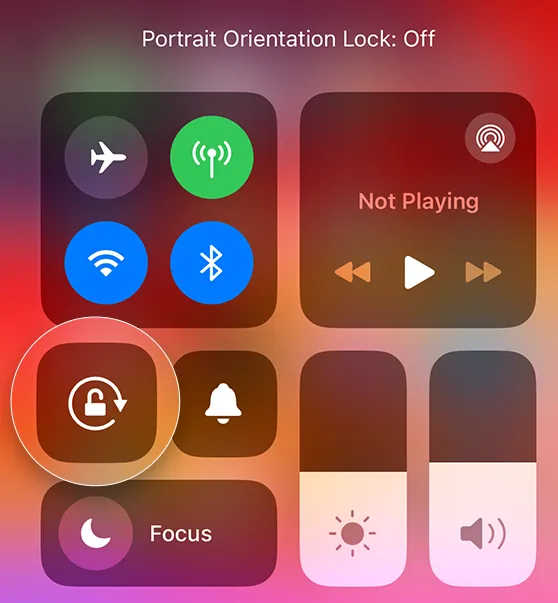
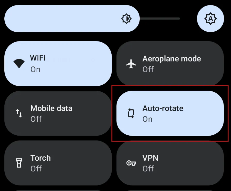
If you don't lock the orientation of your app (which is what we'll talk about in the rest of this article), users can simply rotate their device to change the orientation of your app, as long as "Auto-rotate" is enabled in their system settings (Android) or orientation lock is disabled on iOS. These settings can be accessed from the quick settings that you pull down from the status bar at the top of the screen:
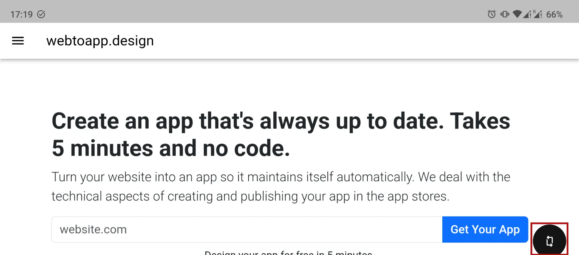
Android also has a small rotation button in the corner if auto-rotate is disabled but you rotated your device.
Our Recommendation
In our opinion it's best to stick to the default, where both orientations are allowed. There's many reasons for this, and the reasons can be split into the following two groups.
Your Website Already Supports it
When a user visits your website, they can hold their device however they want. It's extremely uncommon for websites to lock the orientation to only portrait or only landscape mode. So chances are your website can be accessed in both orientations by browser users and therefore your website should work well in both orientations.
Additionally, there are so many different devices that all have different screen sizes and aspect ratios (ratio of screen width to height). Just think of all the different smartphone models (there's an especially large variety of Android devices, e.g. the Samsung foldable phones), tablets, laptops and computer monitors. Your website should be usable on all of these different screens, which is typically achieved by using so-called responsive design principles.
And when you use responsive design to make sure that your website works on all screen sizes, your website will automatically also work in both portrait and landscape mode. So you have no additional maintenance cost just from allowing both orientations in your app, because your website should already be designed to handle it.
Side note: This is also the reason why we don't offer an option to restrict your app to only smartphones and no tablets (or vice versa). There's no clear dividing line between smartphones and tablets, because screen size is a spectrum. And the device type you want to lock out from your app would still be able to access your website through a browser. So all you'd be doing is putting your app users at an unnecessary disadvantage.
Maximum Flexibility
Typically your app will contain some content that would be best viewed in portrait and some that might look better in landscape mode. Allowing users to switch between orientations lets them consume the content in the best way possible.
Last but not least, your app users all have different preferences. Some might just like landscape mode over portrait even though it may be completely unexpected for you. This can have many reasons that aren't immediately apparent. One example I've personally seen is older people preferring landscape mode because then the on screen keyboard has larger keys, which makes it easier for them to type. I'm certain there's plenty of other reasons like this that we just don't think about because they're working around accessibility issues that we personally aren't affected by.
So let your users make their own choice! Your app users are your most engaged customers, so you should treat them best and not artificially restrict them to one device orientation.
Benefits of Portrait Mode
- Consistent User Experience: Most users are accustomed to browsing websites and apps in portrait mode. By allowing portrait mode, you create a familiar experience.
- Focused Interaction: Portrait mode is often better for reading content, scrolling through lists, or navigating complex menus.
Portrait mode is most suitable for content-heavy apps like blogs, news apps and e-commerce shops.
Benefits of Landscape Mode
- Enhanced Media Consumption: Landscape mode offers a wider view, which is ideal for video content, photo galleries, and certain types of games.
- More Screen Space: In landscape mode, there's often more room to display side-by-side elements, making it great for split-screen functionality or multi-panel interfaces.
Landscape mode is best for games, video streaming apps and apps with complex dashboards that need a lot of horizontal space.
Conclusion
There’s no one-size-fits-all answer to the orientation dilemma. Typically the best option is to allow all orientations, but your decision should be guided by your app’s purpose and your target audience’s preferences. If your app has a specific use case that fits neatly into portrait or landscape mode, locking it in that orientation could be fine.
Ultimately, the goal is to create an app that feels intuitive and enjoyable, no matter how your users choose to interact with it.
Did you make your choice? You can adjust the orientation lock setting in your dashboard.
Related Articles

How to: Show and Use Your App's Settings Screen
The settings page is where your app users can change their preferences and access other features like viewing licenses and using the account deletion feature. Here's how you can show it in your app.

Using Cookies to Keep Users Logged In
After converting your website to an app, you want the app to offer a good user experience. Here's how you can keep users logged in by making sure cookies are configured correctly.

How to Fix Caching Issues in Your App
A correct caching setup on your website is essential to make sure changes on your website show up in your app immediately.

Jan Bunk
With a background in computer science, Jan founded webtoapp.design in 2019 and developed the underlying software to convert websites into apps. With experience and feedback gathered from hundreds of published apps, he strives to write easy to follow guides that help you with everything related to app creation, publishing and maintenance.