How to Make Your Website Fast & Mobile Friendly
Posted on 16. August 2023 by Jan Bunk

Improving Your Website Speed to Improve App Performance
Since apps created with webtoapp.design display your website with a built-in browser (Chrome on Android, Safari on iOS), the speed of your website dramatically impacts the speed of your app. To be exact, it’s pretty much identical. If your website takes one second to load a specific page, the app will also need one second. Because of that it’s very important to make your website as fast as possible.
Measuring Performance with PageSpeed Insights
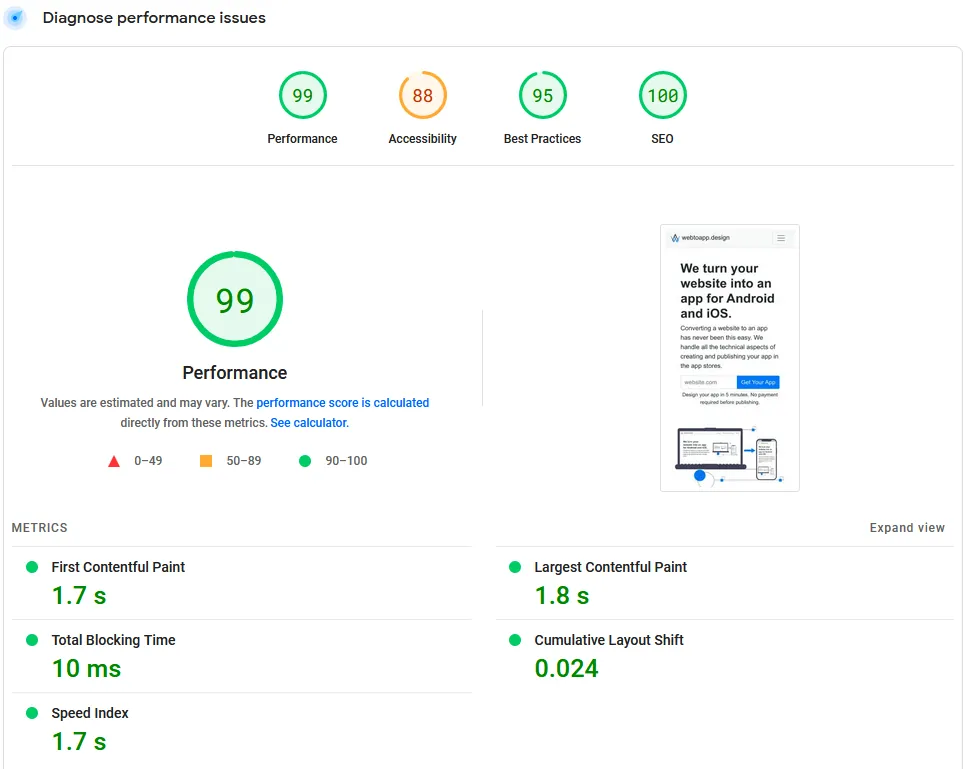
A good starting point for evaluating and improving your website’s performance is the PageSpeed Insights test. This is a test created by Google which simulates how a user would experience your website in terms of performance (fast or slow). The test simulates both a desktop computer loading your website (with a fast internet connection and lots of processing power) and a mobile device (with a slower internet connection and less processing power). If you want to relate the results from the test to the performance of your app, you most likely want to look at the results for the mobile device, since the app is used on smartphones and tablets.

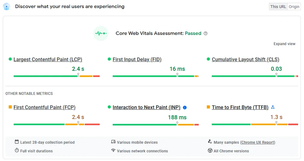
At the top, you might also see a section “Discover what your real users are experiencing”. This is the most realistic data, since it’s taken from actual users of your website (collected anonymously by the Chrome browser). Keep in mind that this is only available if there were enough people visiting this page of your website in the past 28 days. If you don’t have that, the simulated performance data works perfectly fine to see how quickly your website loads.

Improving your website’s performance also benefits your website’s ranking in the Google search results, since Google ranks faster websites higher (since users prefer that). Aside from happier users, that’s just another benefit of improving your website’s loading times.
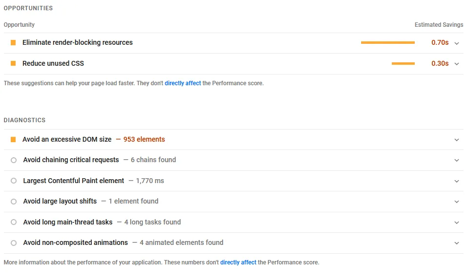
When you scroll down a bit on the PageSpeed Insights page you will find suggestions on how you can improve the speed of your website.

General Suggestions to Improve Website Speed
Here are a handful of tips that can usually minimize the time your website takes to load:
Upgrade or switch to a faster hosting package
Use less plugins and scripts
Optimize images (smaller dimensions, modern file formats like webp) to minimize their file size
Of course there are many other ways to optimize the performance of your website, but these are some general tips that can help almost any website, no matter what software you use to operate your website.
Making Your Website Mobile Friendly
These days mobile devices have become the primary way through which users access the internet. Because of that it’s important to have a mobile friendly website and app. A mobile friendly website ensures that visitors can effortlessly navigate and engage with your content, regardless of the device they are using.
Responsive Design
Responsive design is the cornerstone of creating mobile-friendly websites. It involves designing and developing a website in a way that adapts to various screen sizes and orientations. In other words, the layout and content of the website automatically adjust to provide an optimal viewing experience on devices ranging from small smartphones to large desktop monitors.
Basically it works by making components of your website smaller or larger and moving them around depending on the size of the screen.
Assessing Mobile-Friendliness
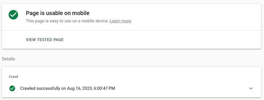
Google recognizes the importance of mobile-friendliness and provides a tool for assessing it, similar to the PageSpeed Insights tool we mentioned above. The Google Mobile Friendly Test page allows you to check how mobile friendly your website is. Ideally, you want to see this message after testing your website:

Common Issues and Fixes
Several issues can hinder the mobile-friendliness of a website. Not all of these can be identified automatically by Google’s test, so keep an eye out for them yourself too.
Unreadable text: Text that is too small to read without zooming can frustrate users. Ensuring legible font sizes is crucial for a positive mobile experience.
Clickable elements too close together: Buttons and links placed too closely together can lead to accidental clicks. Move them further apart to avoid user frustration.
Content wider than screen: Users should be able to navigate your site without needing to scroll horizontally, as it can be cumbersome on small screens. Make sure the elements on your website are not wider than the screen, so horizontal scrolling is not possible/necessary.
Lots of pop-ups: Alerts and dialogs that show up automatically can negatively impact the user experience, especially on mobile devices. Sometimes there’s no way to avoid them though (e.g. cookie banners), so make sure to follow these best practices to make them as user friendly as possible:
Pop-ups should be easy to dismiss, so don’t use a tiny “X” button that is impossible to hit on a smartphone.
Pop-ups should show up immediately when loading the page if possible. There’s nothing more annoying than trying to click a link and just as you click a pop-up shows up and you accidentally click that instead.
Related Articles

What are Monthly Active Users?
Confused about monthly active users for your app? See concrete examples of how the user counts are calculated and discover what happens when your app reaches the limit.

How to Password Protect Your App
You can set a password that will be required to open the app. This is useful if you want to restrict access to your app to only a limited group of people.

Why we Offer our App Builder as a Subscription Service
We chose to only offer our app creation services for a subscription fee because it aligns our incentives with yours. This allows us to help you create and maintain the best app possible.

Jan Bunk
With a background in computer science, Jan founded webtoapp.design in 2019 and developed the underlying software to convert websites into apps. With experience and feedback gathered from hundreds of published apps, he strives to write easy to follow guides that help you with everything related to app creation, publishing and maintenance.